SEO Score
+0%
Aliqua id fugiat nostrud irure ex duis ea quis id quis ad et.


How I transformed a non-responsive, single-language site into a high-authority medical platform, resulting in a 45% increase in organic clicks and a first-page Google ranking across three languages.
Aliqua id fugiat nostrud irure ex duis ea quis id quis ad et.
Aliqua id fugiat nostrud irure ex duis ea quis id quis ad et.
Aliqua id fugiat nostrud irure ex duis ea quis id quis ad et.
How I migrated a Shopify store to a WordPress & SureCart solution, reducing monthly overhead while maintaining a playful, conversion-focused brand identity for a local clothing brand in Portugal.
How I transformed a non-responsive, single-language site into a high-authority medical platform, resulting in a 45% increase in organic clicks and a first-page Google ranking across three languages.
Conversion-Optimized Design
Responsive Design
Content Creation
Copywriting
UX Writing
E-Commerce Set-up
WeSea Collection, a small Lisbon-based brand producing handmade terry-towelling sets, was looking to move away from Shopify as they prepared to close the brand. They needed a lean, high-performing alternative to sell through their remaining stock. While the product was high-quality and locally made, the previous digital presence didn’t fully capture the brand’s unique “laid-back with attitude” personality.
The objective was twofold: significantly lower the store’s running costs by migrating to a WordPress/SureCart stack and redesign the user experience to reflect the brand’s playful identity, using the light blue and yellow brand colours. The site needed to be simple (supporting the remaining one product in stock and its three variations), fast, mobile-optimized, and built for immediate conversion.
Infrastructure migration: I replaced the Shopify store with WordPress and SureCart, allowing the client to manage inventory and payments with near-zero monthly fixed costs.
Brand-centric design I integrated custom sunflower graphics and bold, rounded heading typography to mirror the “playful but edgy” vibe of the brand and its unique product line.
User-focused design: The site features a simple navigation structure and an easily scannable hierarchy. I ensured legible text sizes and verified colour contrast ratios to meet accessibility standards. The site includes aria-labels for buttons and is fully keyboard-navigable. To reduce cognitive load, the logo (linking to home) and cart were strategically placed in conventional positions.
Mobile optimization: To accommodate the 80% of users shopping via mobile, I transitioned the desktop multi-column layout into a one-column design with large, finger-friendly touch targets.
The “Rule of three” grid: I utilized a three-column grid for the product overview. This allows shoppers to scan and compare all colour options at a glance, effectively preventing “choice paralysis.”
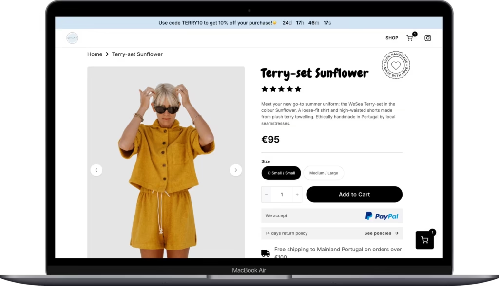
Immediate value & urgency: A promotional banner was placed above the header featuring a time-limited code to drive immediate action.
Floating cart: In addition to the static header cart, a floating cart remains consistently visible in the bottom right corner. This serves as a persistent reminder of purchase intent and ensures the shopper is always one click away from checkout.
Streamlined cart experience: Instead of a separate cart page that breaks the user flow, I used a cart drawer. This keeps the user on their current page while providing a clear summary of their selection, reducing bounce rates during the final steps. The “View product” to “Quick add” flow ensures the path from discovery to the payment gateway is as short as possible.
Social proof integration: I implemented a testimonial slider across all pages, showing three reviews at a time. By featuring “What our sun-chasers say,” we provide the social validation needed for new visitors to feel confident in the brand’s quality.
Visual trust signals: I designed a highlight section with icons featuring “Made in Portugal”, “Handmade by women”, “Small batches” and the fabric certifications to justify the €95 price point through local craftsmanship and exclusivity.
Optimized “Above-the-fold”: I structured the PDP so that the product title, handmade badge, price, star ratings, and the CTA “Add to cart” button are all visible without scrolling. This ensures that the primary conversion goal is always front and center.
Building trust & value: Detailed product specifications and shipping/payment info were placed directly under the buy box to address common objections early.
In addition, I added a dedicated “Handmade” badge in the top right corner of the product information block. This serves as a constant visual reminder of the brand’s primary USP (unique selling point) right at the point of purchase.
Increasing AOV (average order value): I integrated a “You may also like” section to showcase other colours and encourage larger baskets, ensuring the collection is visible regardless of the landing source (e.g., ad, search or social).
Psychological triggers: I integrated cart urgency tags (e.g., “Only 1 piece left”) based on real-time inventory. This leverages scarcity to encourage faster decision-making for a small-batch brand.
By migrating to WordPress/SureCart, the client eliminated recurring Shopify fees, making the sale of their “last pieces” significantly more profitable. The site now feels like a cohesive extension of the product range in both tone and design. The lightweight SureCart integration resulted in fast page load speeds, contributing to lower bounce rates.
E-Commerce CRO improvements to be done
If the client required a long-term growth strategy, I would have recommended the following high-impact optimizations to further increase the conversion rate:
Strategic insight: SureCart vs. Shopify
Choosing the right platform is a balance of cost versus scalability. For this project, WordPress and SureCart was the optimal choice because it provides a professional checkout with near-zero overhead. However, for clients scaling to high-volume traffic, I recommend Shopify for it’s global scalability and “hands-off” reliability.
Choose SureCart/WordPress if: You are a small-to-medium business focusing on lower running costs and want full control over your site’s design and SEO. However, it requires proactive maintenance to ensure the checkout environment remains stable.
Choose Shopify if: You are scaling rapidly and need 100% uptime reliability. While the monthly subscriptions and app fees are higher, Shopify is the most scalable and reliable e-commerce platform currently available, making it the industry standard for high-volume retailers.